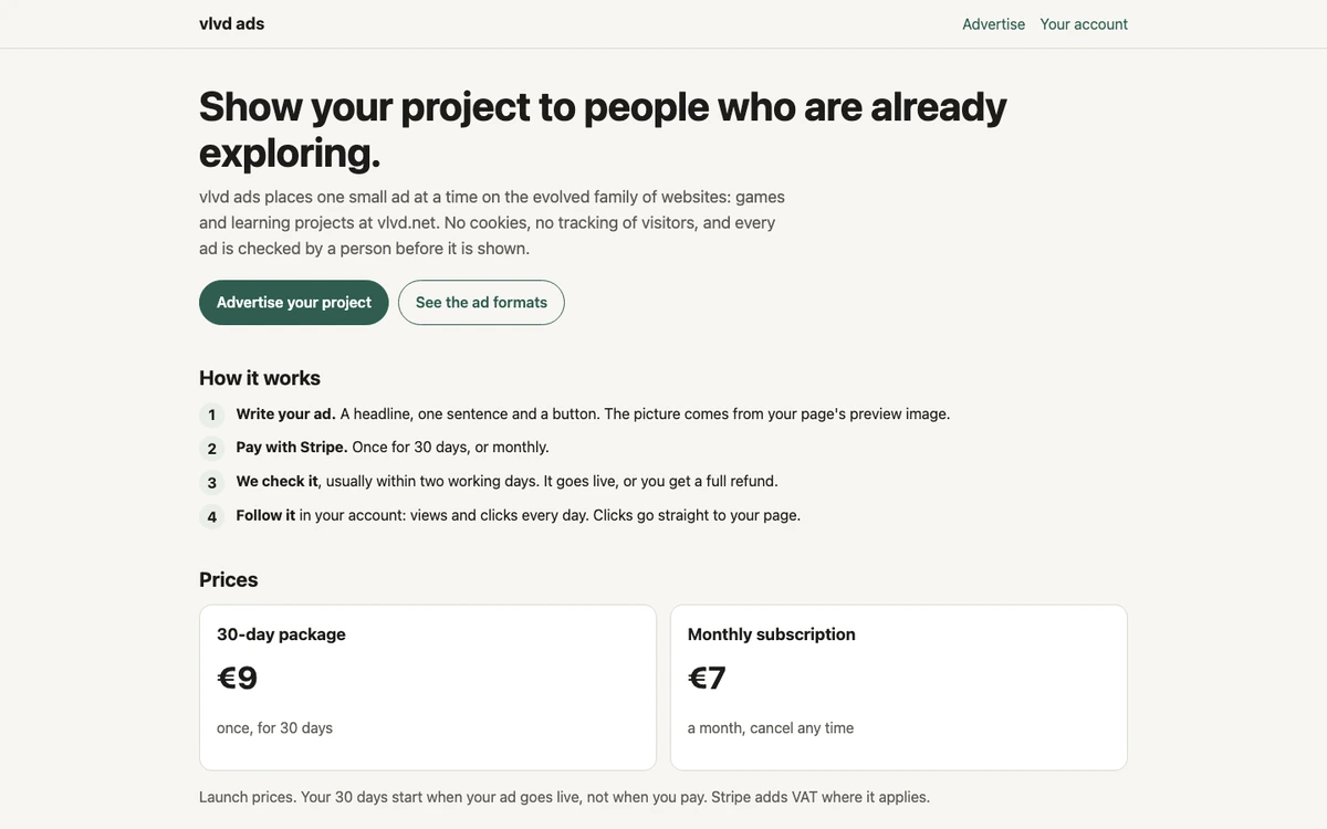
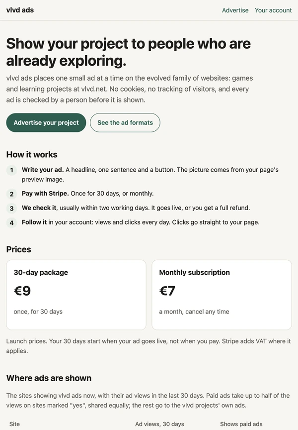
If you have ever clicked an ad and wondered why the page that opened felt so different from the rest of the site, you have met a landing page. So, what is a landing page in online advertising? It is the one page an ad sends you to: the place where the ad's promise either holds up or falls apart. A small ad service such as vlvd ads shows the idea at its plainest, because each of its ads is a headline, one sentence and a button, and a click goes straight to the page the ad describes.
What is a landing page in online advertising?
Wikipedia's landing page article defines it as a single web page that appears when someone clicks a search result, a marketing email or an online advertisement. It also lists the other names you may see: lead capture page, squeeze page, static page and destination page. They all point at the same thing, the first page a person sees after the click.
The same article says the page usually carries sales copy that is a logical extension of the ad. That phrase is the heart of it. The ad starts a sentence, and the landing page finishes it. If the ad talks about chess openings, the page talks about chess openings, not about the company's history or its other products.
A landing page can be a page made only for one campaign, or it can be an ordinary page on a site that an ad happens to point to. What makes it a landing page is its role, not how it was built.
Why the ad and the page must match
An online ad is tiny. It has a few words to earn a click, so it makes one promise and leaves the rest for later. The landing page is where later arrives. When the page keeps the promise, the reader stays. When it does not, the reader feels misled and has little reason to stay.
A match has three parts:
- The same subject. The page is about exactly what the ad was about, not a near relative of it.
- The same words. The headline at the top of the page echoes the words of the ad, so the reader knows at a glance that the click worked.
- The same offer. Whatever the ad said the reader would get is on the page, without a hunt for it.
Some ad networks write this into their rules. The service named above, for instance, states that an ad must describe the page it links to truthfully, and a person checks every ad before it is shown, usually within two working days. The live article on why ad networks reject some ads goes through what such a check looks at.
The two kinds of landing page
The landing page article splits them into two kinds, reference and transactional.
A reference page gives information: text, pictures and links that tell the reader about the thing the ad mentioned. A guide to a game, a description of a course or a page about a tool all fit here. The reader learns something and decides what to do next.
A transactional page asks for something. It holds a form to fill in, often an email address, so the business can keep in touch. The article says the aim of this kind is to gather as much information about the visitor as possible.
That difference matters to you as a reader. A reference page lets you look around and leave. A transactional page wants something from you before it gives you much. Knowing which one you are on tells you what the page is after.
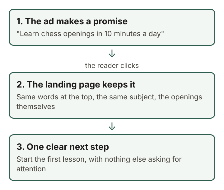
A worked example: one ad, one page
Follow a single ad from start to finish. Say a small site teaches chess openings, and its owner writes an ad for a service that allows a headline of up to 40 characters, one sentence of up to 90 and a button of up to 18.
- The headline: "Chess openings in 10 minutes a day" (34 characters).
- The sentence: "Short daily lessons on the first moves of a game, from the Italian to the Sicilian." (83 characters).
- The button: "Start lesson one" (16 characters).
Now check the landing page against those three lines. Its top line should say something close to "Chess openings in 10 minutes a day", so the reader knows the click landed in the right place. Its first screen should show the daily lessons and the openings named in the sentence. And the button's promise, "Start lesson one", should lead straight to lesson one, not to a page about something else or about the author.
There is one more link between the two. On that service the ad's picture is the advertised page's own preview image, its og:image, the image a page offers when someone shares it. So the page shapes the ad as much as the ad points to the page. If the preview image shows a chessboard, the ad shows a chessboard, and the reader who clicks sees the same board waiting.
If any of the three lines does not hold on the page, the owner fixes the page or the ad until they agree. That is the whole job.
How a landing page is measured
The landing page article says the actions a visitor takes on the page determine an advertiser's conversion rate, and that marketers look at click-through rates and conversion rates to judge an ad.
Wikipedia's page on conversion rate optimization describes the conversion rate as the share of visitors who complete a desired action, such as making a purchase or sending their contact details. It shows a simple funnel: saw the ad, clicked the ad, made the purchase. That funnel has two rates in it.
- The click-through rate belongs to the ad: of everyone who saw it, how many clicked.
- The conversion rate belongs to the landing page: of everyone who clicked, how many did the thing the page asked.
Splitting the two tells an advertiser where a problem sits. Many clicks and few actions point at the page. Few clicks point at the ad. A count of views and clicks per ad per day, the kind an advertiser sees on the service mentioned at the start, covers the first rate; the second is read on the advertiser's own page.
Where landing pages came from
According to the landing page article, landing pages began in late 2003 in Microsoft's IT departments, as a response to poor online sales of Office.
The same article notes that marketing experts advise taking the navigation menu off a landing page and keeping links to a minimum. The reasoning is simple: every extra link is a door out, and a page with one job does better with one door. That is why so many landing pages feel bare next to the rest of a site. The bareness is on purpose.
Frequently asked questions
Is a landing page the same as a home page?
Not usually. A home page serves every visitor and links to everything, while a landing page serves the people who clicked one ad and points them at one next step.
Why do landing pages often have no menu?
A menu gives the reader many ways to leave the page's one purpose. The landing page article notes that marketing experts advise removing it and limiting links.
Does a landing page have to ask for an email address?
No. Only the transactional kind asks for details through a form; a reference page simply informs, and the reader can simply read and leave.
What makes a landing page misleading?
It is misleading when it does not deliver what the ad promised: a different subject, a different offer, or the promised thing hidden behind steps the ad never mentioned.
A landing page as the second half of an ad
An ad and its landing page are one message split across a click. The ad gets a few words to make a promise; the page gets a whole screen to keep it. When the subject, the words and the next step all line up, the reader moves from one to the other without a jolt and knows exactly where they are. When they do not, no amount of design on the page makes up for the broken promise. The plainest way to judge any landing page is to hold it next to the ad that led to it and ask whether the page says what the ad said it would.
vlvd ads
Show your project to people who are already exploring. Visit ads.vlvd.net